Das Stil-System ist das Kernstück zur Steuerung der Darstellung von Inhalt.
Über den Reiter Behavior können Stile auf Paragraphen / Inhalte angewendet und damit die Darstellung variiert werden.
Stile und Paragraph-Typen
Über den Reiter Behavior können Stile auf Paragraphen / Inhalte angewendet werden.

Stile sind individuell
Die Stile der Paragraphen sind sehr unterschiedlich und hängen von individuellen Setups des Systems ab. In Ihrem System können zusätzliche Stile konfiguriert bzw. hier beschriebene Stile deaktiviert sein.
Die folgenden Liste enthält die typischen Stile der Paragraph-Typen
Klicken Sie auf das Gruppen Label, um Details zu den Stilen aller Paragraph-Typen der Gruppe ein- bzw. auszublenden. Die Stil-Varianten werden in den einzelnen Paragraph-Features näher beschrieben.
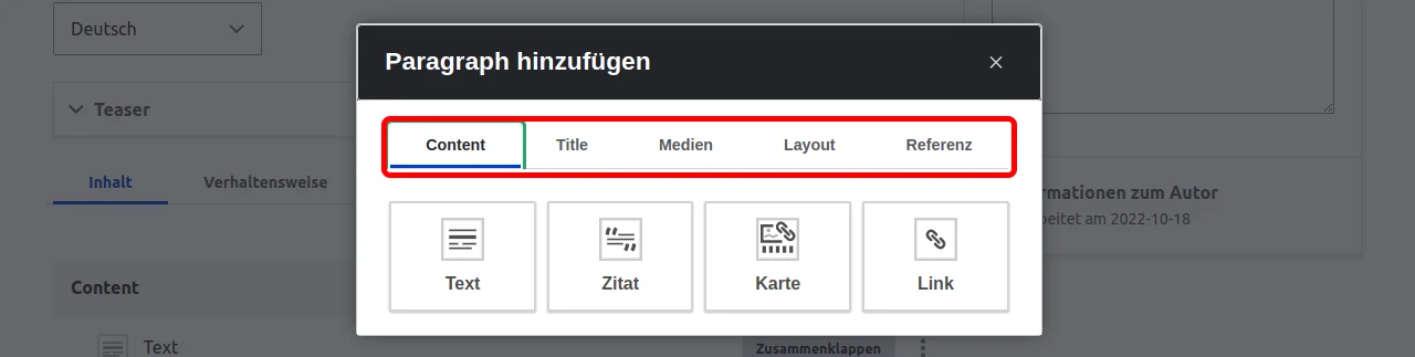
Stile der Paragraphen Typen in Gruppe Inhalt:
- Text
- Inhalt Style
- Indent top level
- Never indent
- Inhalt Style
- Quote
- ( No Styles available )
- Fact
- Teaser Style
- Default
- Primary Teaser
- Secondary Teaser
- Fact Style
- Horizontal, dominant icon
- Horizontal, dominant title
- Vertical, dominant title
- Vertical, dominant icon
- Vertical, dominant icon, circle
- Vertical, dominant title, circle
- Teaser Style
- Card
- Teaser Style
- Default
- Primary Teaser
- Secondary Teaser
- Teaser Style
- Link (Button)
- Größe
- Regular
- Full width
- Link Style
- Standard
- Button to documentation
- Button to feature
- Ghost button
- Primary button
- Secondary button
- Größe
Stile der Paragraphen Typen in Gruppe Titel:
- Titel
- Inhalt Style
- Indent top level
- Never indent
- Ausrichten Style
- Links
- Zentriert
- Inhalt Style
- Untertitel
- Ausrichten Style
- Links
- Zentriert
- Ausrichten Style
- Hero
- Minimal Height
- Regular
- Mittel
- Large
- Slim
- Protected area
- Align: Left, 1/2 Protected
- Align: Left, 1/3 Protected
- Align: Middle, 1/3 left + 1/3 right Protected
- Align: Middle, 1/5 left + 1/5 right Protected
- Align: Right, 1/2 Protected
- Align: Right, 1/3 Protected
- Keine
- Hero Style
- Black text, light box
- Plain Black
- Plain White
- White text, dark box
- Minimal Height
Stile der Paragraphen Typen in Gruppe Medien:
- Medien
- Layout
- Keine
- Media - four columns 1 - 1 - 1 - 1
- Media - three columns 1 - 1 - 1
- Media - two columns 1 - 1
- Slider
- Keine
- Standard
- Center Mode
- Layout
- Linked Image
- Keine Stile verfügbar
Stile der Paragraphen Typen in Gruppe Layout:
- Container
- Layout
- Keine
- 4 equal columns
- Equal columns
- Three columns 1 - 1 - 1
- Three columns 1 - 1 - 2
- Three columns 1 - 2 - 1
- Three columns 2 - 1 - 1
- Two columns 1 - 1
- Two columns 1 - 2
- Two columns 1 - 3
- Two columns 2 - 1
- Two columns 3 - 1
- Two columns Mini teaser
- 50% width
- Language visable
- Always visible
- Hide for
- Show for
- Container Style
- Default
- Alternative
- Inverted
- Layout
- Zusammenklappbar
- Collabsible Style
- Akkordeon
- Horizontal Tabs
- Horizontal Pills
- Vertical Pills
- Open Elements (nur bei Akkordeon)
- First open
- All closed
- All open
- Collabsible Style
- Trennzeichen
- Trennzeichen Style
- Linie
- Example below
- Leer
- Punkte
- Trennzeichen Style
Stile der Paragraphen Typen in Gruppe Referenzen:
- Content Referenz
- Teaser Style
- Default
- Primary Teaser
- Secondary Teaser
- Teaser Style
- Formular
- Keine Stile verfügbar (aber Zugriff auf definierten Forms)
- Liste
- Checkbox Look Content
- Aus der Bibliothek
- Keine Stile verfügbar (aber Zugriff auf Elemente der Bibliothek)
- Mailchimp Signup
- Keine Stile verfügbar (aber Zugriff auf Mailchimp Forms)