Responsive design
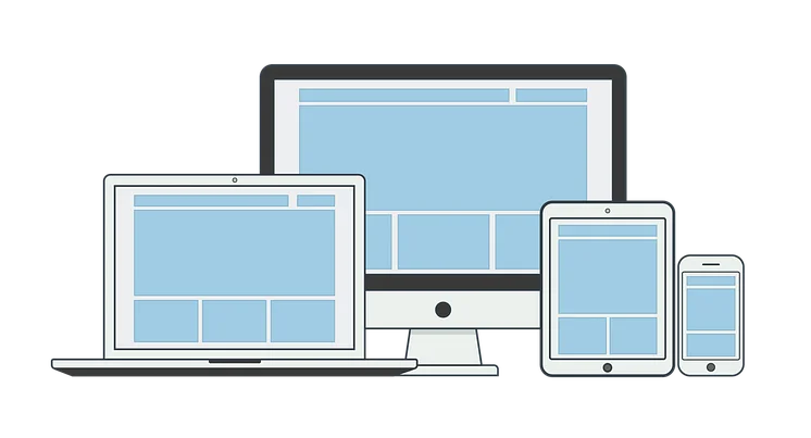
Full-responsive design. All content components are optimized for different screen sizes and end devices. A list with 4 elements arranged next to each other can also be displayed in 2 columns or below each other on small-screened devices.
Columns of the same size (e.g. with 6 images)
4 columns
3 columns 1-1-1
3 columns 1-2-1

3 columns 1-1-2
2 columns 1-1
2 columns 2-1
2 columns 1-2
2 columns 3-1
2 columns 1-3
No columns
50% width
Card and Teaser - Elements that are not vertically centered

Subtitle alignment centered & left
Lorem ipsum dolor sit amet
Lorem ipsum dolor sit amet
Text alignments centered and left
Lorem ipsum dolor sit amet, consetetur sadipscing elitr, sed diam nonumy eirmod tempor invidunt ut labore et dolore magna aliquyam erat, sed diam voluptua. At vero eos et accusam.
Lorem ipsum dolor sit amet, consetetur sadipscing elitr, sed diam nonumy eirmod tempor invidunt ut labore et dolore magna aliquyam erat, sed diam voluptua. At vero eos et accusam.
This is a Page with dummy text.
Content with the wording "Lorem Ipsum" is only a placeholder.