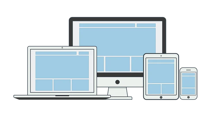
The Primer's basic package comes with a modern, fully responsive design. All content components that you get with the basic package are optimized for the different screen sizes, browsers and end devices. Elements on mobile devices can behave differently than on desktop screens. On a large screen a list can be displayed with four elements arranged next to each other, while on a mobile device all four elements are displayed in a row.
Since the Drupal 10 supports responsive design out of the box the admin interface is optimized for mobile use as well. You can edit and create content while you're on the go.
In the basic package you have the possibility to display your logo on the website, as well as define the primary and the secondary color. This allows you to tailor the look of your website to the color scheme of your organization, product, or campaign.
In addition, you can select from a range of fonts to define the look of the general text and specific titles. Further, there is the possibility to customize the separator element, which can be used for the better structuring of the content.
The ability to customize content also allows you to further influence the appearance of the website. This allows you to create a completely unique identity for your project despite standard design.