With an increasing number of fields, forms quickly become unclear and users are increasingly reluctant to fill them out. It is then important to proceed in a structured way to achieve an optimal result:
With our tools and the following approach, a complex form can be made appealing and simple, and the process is made accessible to the visitor.
In order to structure the form, we recommend the following first:
- Collect all fields
- Group them logically - from the user's perspective
- Identify the mandatory fields
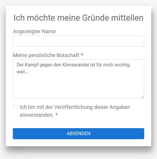
Form widget
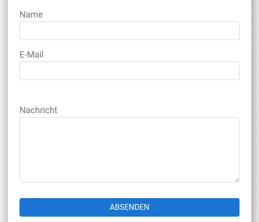
With its eye-catching and appealing appearance, the form widget stands out from regular content and quickly attracts attention. With a call-to-action title, interest can be raised and the number of conversions can be increased.

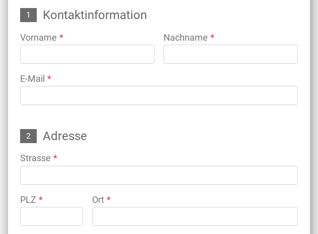
Vertical grouping using white space
A subtle visual grouping of elements can be achieved with a white space between the groups. This makes the form appear more structured and clearer without the use of a frame, which in turn would increase its visual complexity. If further grouping elements are required, subtitles can be used, which divide the form into distinct sections.
Horizontal Grid Layout
Complex forms can quickly become lengthy. By using flexboxes, multiple elements can be placed on one line in wider forms. It is important to note that only elements that belong together should be placed on one line. An example is first name + last name or postcode + city. Such familiar combinations make, for example, an address entry recognisable. However, elements in the second column can be quickly overlooked if unusual combinations are used.
For narrow "mobile" forms, we advise against using a horizontal layout, as the fields are often too short for typical input values and users orient themselves vertically.


Vertical grouping using steps
If further levels are required for grouping, subtitles can be used. They divide the form into distinct sections.
Conditional sections
For very complex forms it is possible to hide optional fields or steps. Some fields can be displayed/hidden using a pre-field, for example a checkbox. Concrete examples would be:
- Please send with documents (address must be entered).
- Please call back (display of additional fields for availability, time, phone number).
- I take part in the meal (menu choice or preference vegetarian/meat must be indicated).
This can simplify the initial display of a form and make it easy to fill in. Users accept the subsequent higher complexity better and are willing to enter more data, since they can choose for themselves. Conditional sections are recommended if a minimum of two elements can be hidden.

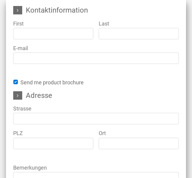
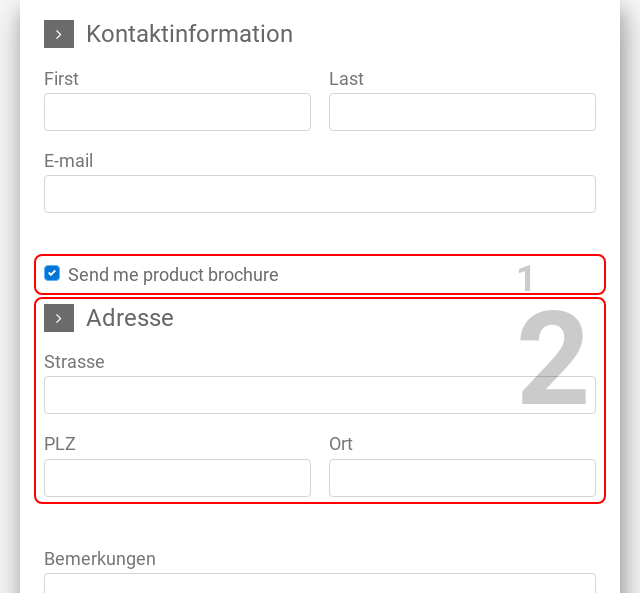
With conditions, a previously optional field can also become mandatory and vice versa.
Multipage wizard
If a form is so complex that it is confusing or daunting on a single page, it can be spread over several pages. Each page is given a name which is displayed in the progress bar together with the page number. This allows the visitor to find out where they are in the form and how much they still have to fill in before they can submit it.

One disadvantage of this approach, however, is that the user does not know which questions are still to come. This can lead to a very high user frustration and abort rate if such information has to be obtained from third parties in several steps
In addition, the necessary number of clicks increases until the form is submitted. This is often associated with potentially higher bounce rates.
If the decision is nevertheless to use a multi-page form, it is essential that a well-established structure guides the user through the form. If the steps are clearly described, the pages clearly arranged and the process flow logically structured, a multi-page form can be a very good alternative to a complex, long form.
Consecutive forms
Instead of querying everything imaginable on one form, it may also be advisable to consider a sign up with several forms placed one after the other.
This way, the hurdle for a first form to express interest in the topic is kept very low. Once you have the contact details of the interested party, further processes can be added.
On the thank you page or via e-mail, the visitor should then be asked to complete the registration process with a second form and thus a definitive registration. For optional components, e.g. of an event, there can be additional follow ups.
Such sequences can be mapped automatically e.g. with MailChimp, which also allows for several friendly reminders.
As a result, the conversion rate can often be massively increased. But such an approach also leads to new obligations: users who have signed up for topic updates expect engaging further information.

Simplicity makes the difference
Users will trust and accept a simple form with good user guidance.
Do not go too far and avoid dark patterns, as users quickly lose confidence and it cannot be regained after an abort. The length of the form, for example, should not be increased with each step. This also applies to the complexity of the questions or the sensitivity of the information requested, which should ideally remain at a similar level throughout the form.
We are happy to help you with the design of sophisticated forms.